
Article: How to Mix and Match Tableware Colours for a Modern Table Setting
How to Mix and Match Tableware Colours for a Modern Table Setting
How to Mix and Match Tableware Colours
There was a time when a "proper" table setting meant everything matched — same pattern, same colour, same everything. That rule has quietly disappeared. Today, some of the most beautiful tables are the ones that don't match at all, at least not in the traditional sense.
Mixing and matching tableware colours is now one of the easiest ways to bring personality, warmth and a sense of considered style to your dining table. Done well, it looks effortless. Done without any structure, it can look chaotic. The difference usually comes down to a few simple principles — and once you understand them, mixing tableware colours becomes second nature.
This guide walks through exactly how to do it, from choosing your base colour to coordinating plates, bowls, cups and glassware into one cohesive, elegant table setting.
Start With a Base Colour
Every well-styled table starts with a foundation, not a feature piece. Your base colour is usually your dinner plate or your largest, most visible item — the one that sets the tone for everything layered on top of it.
Neutral tones make the most versatile base: soft greys, warm sand, deep charcoal or off-white. They're forgiving, they photograph beautifully, and they give you room to introduce colour elsewhere without the table feeling overwhelming.
A useful way to think about it: your base colour is the sentence, and everything else is punctuation. It should hold the setting together, not compete with it.
Combine Neutral and Statement Colours
Once your base is set, this is where mixing and matching tableware colours becomes genuinely enjoyable. Pair your neutral base with one or two statement tones — a deep blue, a rich brown, or a muted green — used in smaller doses across side plates, bowls or serveware.
This approach gives you the best of both worlds: a table that feels calm and considered, with just enough colour to feel personal and modern. It's a technique borrowed directly from interior styling, where a neutral room comes alive through a few carefully chosen accent pieces.
Use Two to Three Complementary Colours

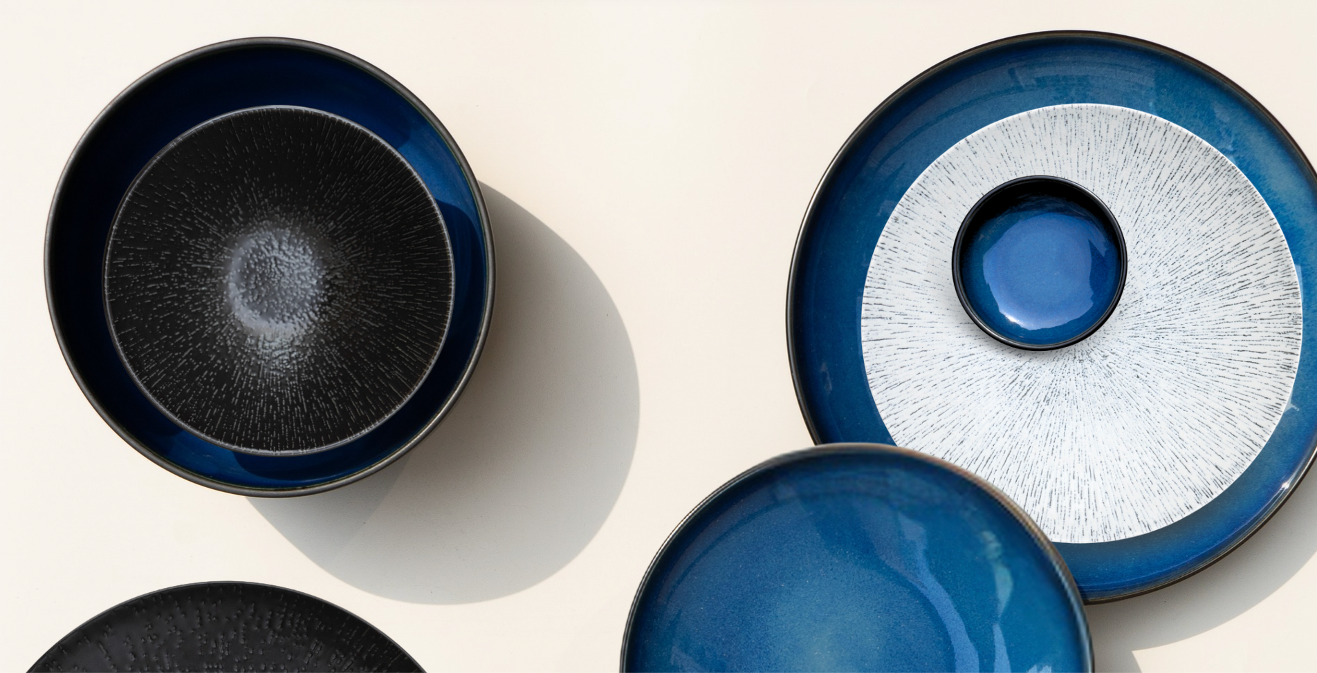
(Photo: Linea Blanc & Noir, Remade Granite & Night & Day Day Break)
If there's one rule to follow when mixing tableware colours, it's this: limit yourself to two or three tones per setting. Beyond that, even beautiful individual pieces can start to compete with each other rather than complement one another.
A simple formula that works well:
- One neutral (for balance)
- One deeper or richer tone (for depth)
- One accent colour (for interest)
This is the same logic used in colour theory generally — restraint creates sophistication, while too many competing colours reads as clutter, however nice each piece is on its own.
Mix Different Shades Within the Same Colour Family
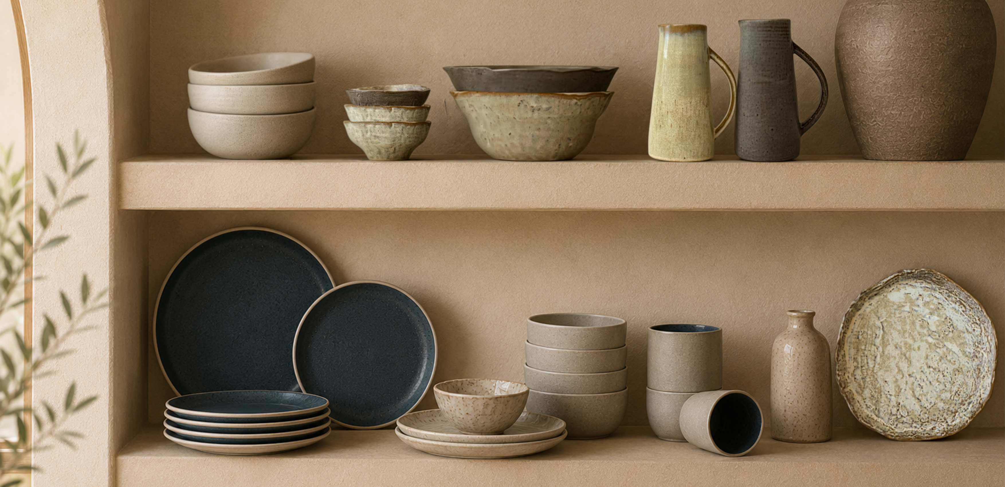
Not every combination needs to involve contrasting colours. Some of the most elegant tables mix different shades within a single colour family — a warm sandy tone alongside a deeper brown, or a pale grey next to a darker charcoal.
This approach is particularly forgiving for anyone new to mixing tableware, because tonal variations within one colour family are almost impossible to get "wrong." The result feels intentional and layered, without any risk of clashing.
Mix Different Shapes and Sizes
Colour is only part of the story. Mixing shapes and sizes adds another layer of visual interest to a table setting — organic, irregular plates alongside classic round ones, or varying sizes of bowls and platters used together rather than in matching sets.
This is where collections designed with mixing in mind make styling considerably easier. Don Bellini's De Terra collection was created around exactly this idea — six earthy hues sharing the same refined, minimalist silhouette, meaning any combination of colours within the range will still feel cohesive because the shapes are consistent throughout.
How to Create Contrast Without Making the Table Look Busy
The goal of mixing tableware colours is contrast, not chaos. A few simple habits keep a mixed table looking curated rather than cluttered:
- Repeat, don't scatter. If you introduce a colour, use it more than once across the table — on a bowl and a side plate, for example — rather than as a single isolated piece.
- Let one element lead. Whether it's colour, shape or finish, choose one point of contrast to be the "hero" and let the others play a supporting role.
- Leave visual breathing room. Plain glassware, simple cutlery or a neutral linen napkin gives busier tableware somewhere to rest the eye.
- Group by warmth. Warm tones (browns, khaki, terracotta) generally sit well together, as do cool tones (blues, greys, greens). Mixing warm and cool works best when one clearly dominates.
Coordinating Plates, Bowls, Cups and Glassware
A cohesive table setting isn't just about the dinner plate — it's about how every element works together.
- Plates and bowls: Choose one as your anchor colour and let the other introduce a secondary tone or finish.
- Cups and saucers: These smaller pieces are ideal for introducing an accent colour without overwhelming the setting.
- Serving pieces: Platters and serving bowls can safely be bolder than individual place settings, since they're used once across the whole table rather than repeated at every seat.
- Glassware: Keep glassware simple and clear where tableware colours are already doing the work, or introduce tinted glassware as an intentional accent if your table setting is otherwise fairly neutral.
Table Setting Colour Combinations to Try

Photo: Moyo HK Restaurant (De Terra Dark Brown, Sandy Khaki, Lustre Pearl, and Night & Day Daybreak)
If you'd like a starting point rather than building a palette from scratch, here are a few reliable combinations:
- Earthy and grounded: Sandy Khaki paired with Dark Brown, finished with Lustre Pearl accents — all available within De Terra.
- Moody and modern: Midnight Blue alongside Daybreak from the Night & Day collection, where a speckled glaze and unglazed exterior add texture as well as colour contrast.
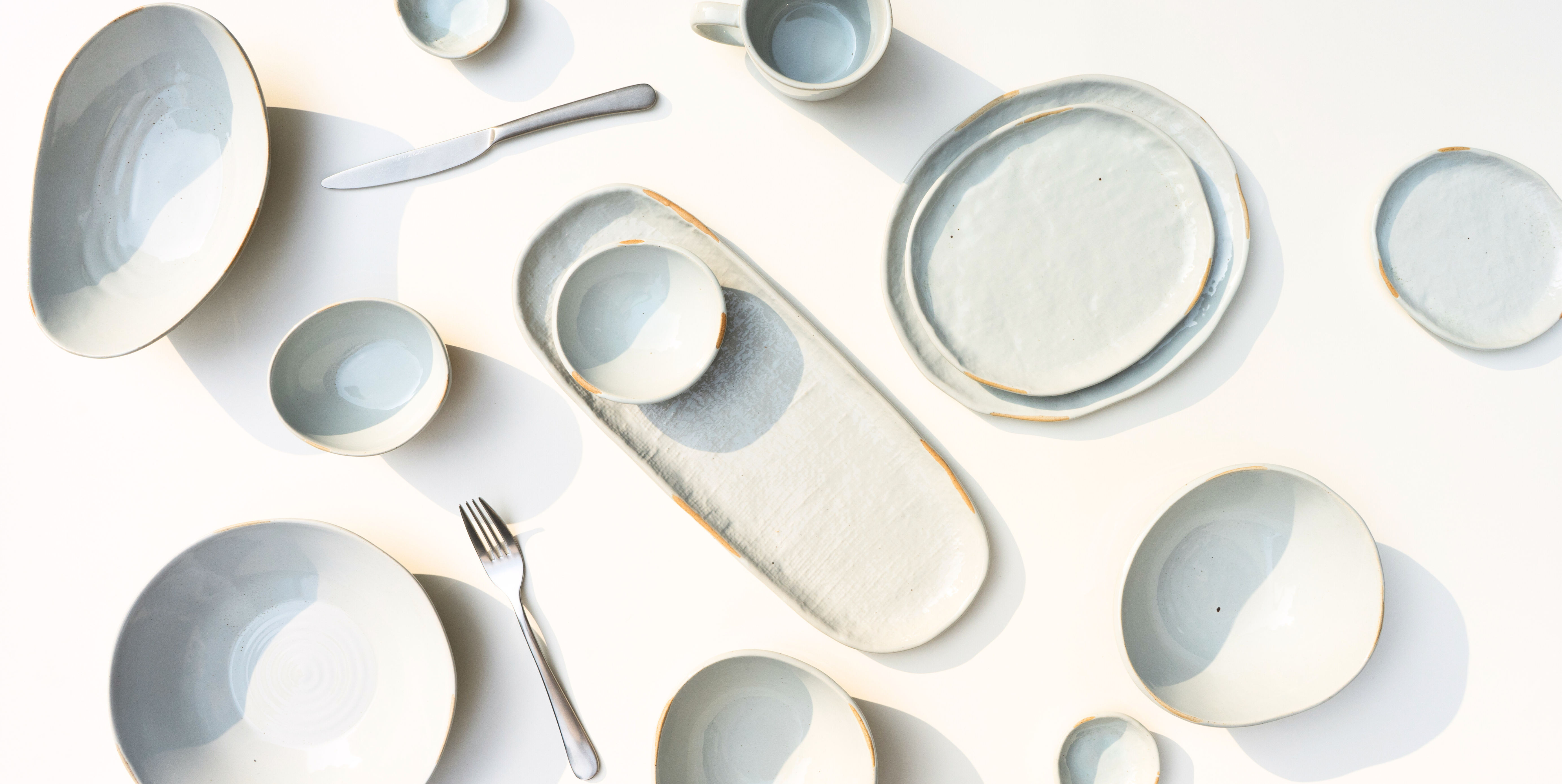
- Soft and refined: Blush pink and taupe grey from the Coze collection, accented with crisp white rims for a gentle, elegant palette.
- Coastal and organic: Beacon Grey with Ultramarine from Craftstone, where irregular, organic shapes add natural texture to the mix.
- Sculptural and striking: A neutral base plate paired with one or two Mirage reactive-glaze pieces as the table's focal point.
Tips for a Modern, Elegant and Cohesive Table
- Choose your base colour first, then build outward — don't try to balance every element at once.
- Limit your palette to two or three tones per setting.
- Use finish and shape, not just colour, to add depth.
- Let one piece or colour lead, and keep the rest in a supporting role.
- When in doubt, stay within one collection — pieces designed together, like De Terra's six hues, are built to be mixed without any guesswork.
Final Thoughts
Mixing and matching tableware colours isn't about breaking rules for the sake of it — it's about understanding a few simple principles well enough to make confident, considered choices. Start with a neutral base, introduce one or two complementary tones, play with shape and finish, and keep the overall palette restrained.
The result is a table that feels personal, modern and genuinely your own — not because everything matches, but because everything belongs together.